Pye · Foundry design system
A trading UI made of paper.
Foundry is Pye’s design system. I created it and I own it: the design language, the tokens, the components and the way design and code stay in step. Its look is paper: thick, slightly 3D, every surface either raised off the page or pressed into it. That kind of finish usually lives on hardware, like a radio’s controls. I wanted to see if it could carry a full, data-dense product UI. I hadn’t seen anyone do it before.
- Role
- Head of Design; created and owns Foundry
- When
- 2025 to 2026
- Scope
- Design system, design language, frontend system
- Built
- Storybook with Pye’s frontend team, then the React build, AI-assisted
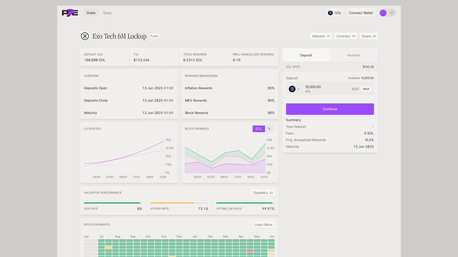
The challenge
A hardware finish, stretched over a whole product.
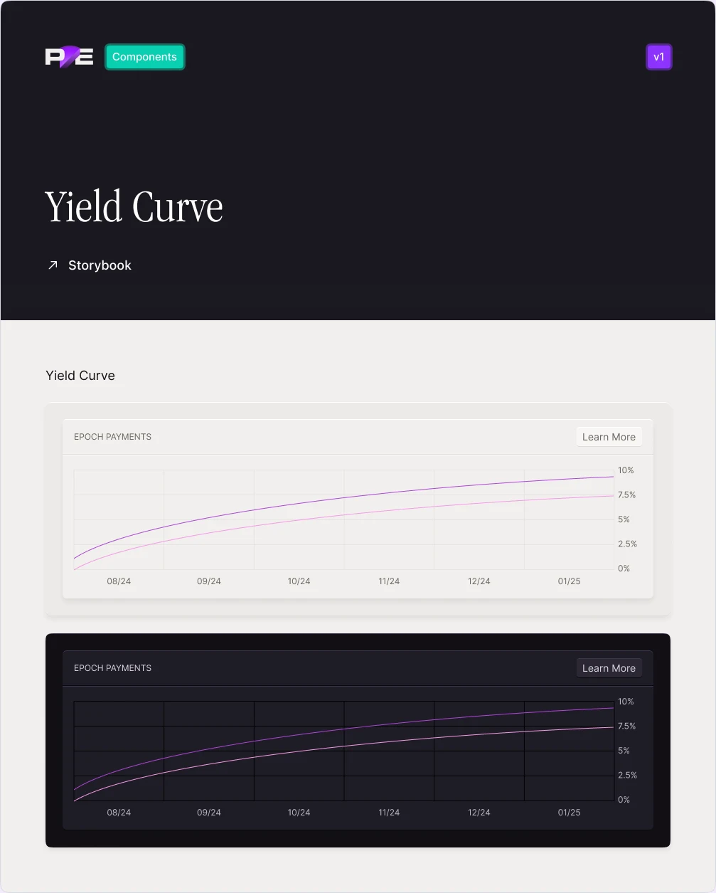
Raised and pressed finishes work on a few big controls. Pye’s screens are the opposite: tables, charts, yield curves and heat maps, full of small numbers. Every one of them had to sit on the same paper surfaces without getting heavy or noisy, in light and in dark.
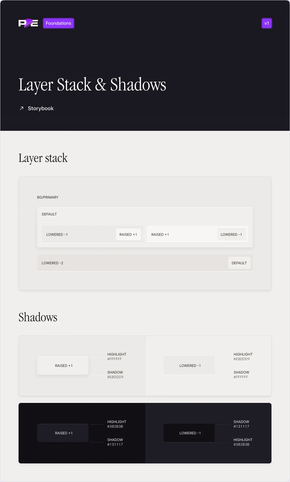
Elevation
Every surface is raised or pressed in.
The layer stack is the core of the system. A base, a default surface on top, and from there each surface is raised one step or lowered one or two. Raised surfaces get a light top edge and a shadow underneath. Lowered ones flip it: the shadow on top, the light below, so they read as pressed into the card.
The layers nest, so a raised row can sit inside a lowered well inside a card, and the edges still make sense. It works the same in light and dark.
Components
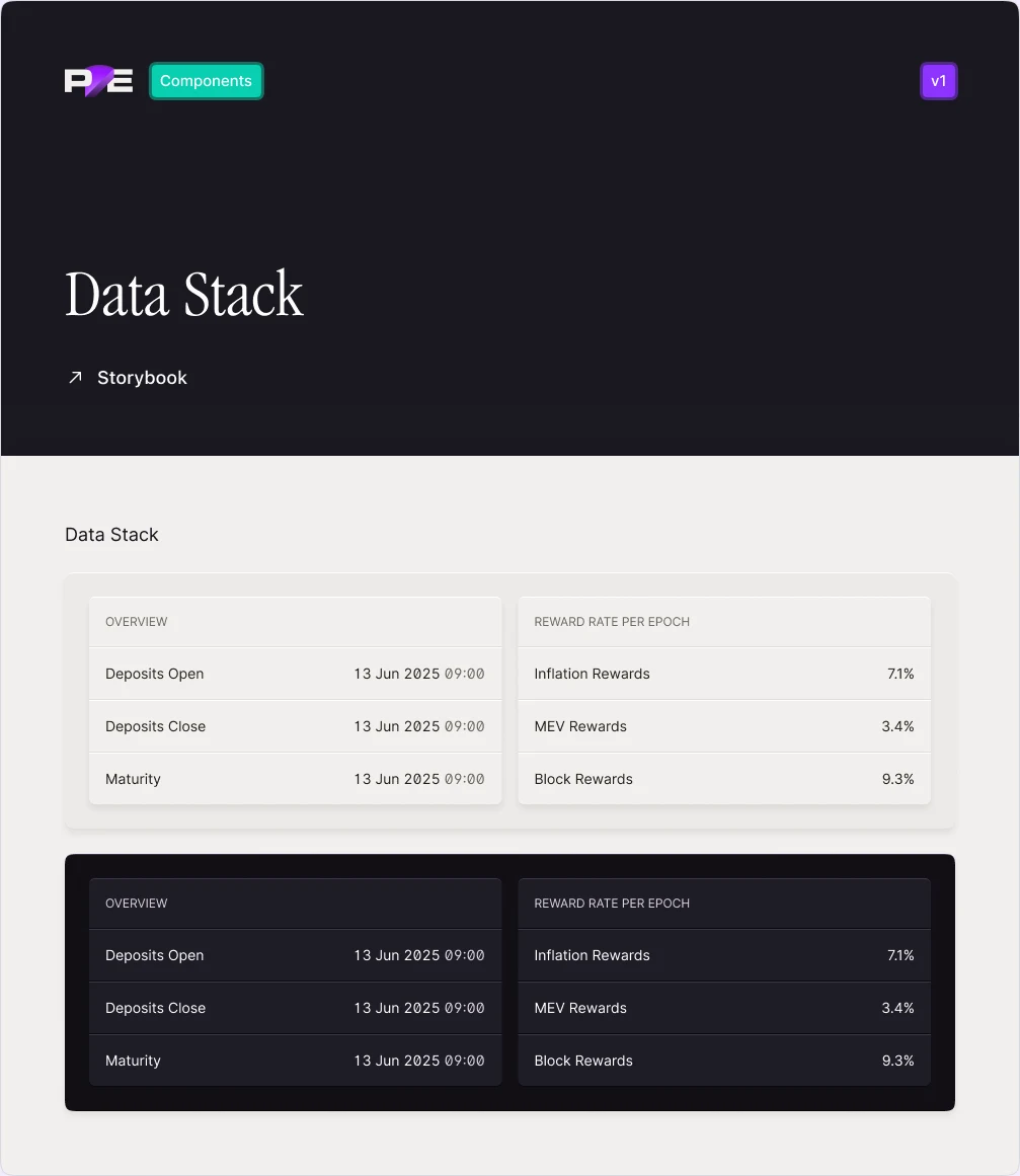
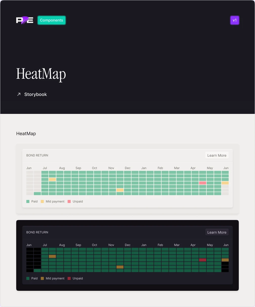
Dense data, still on paper.
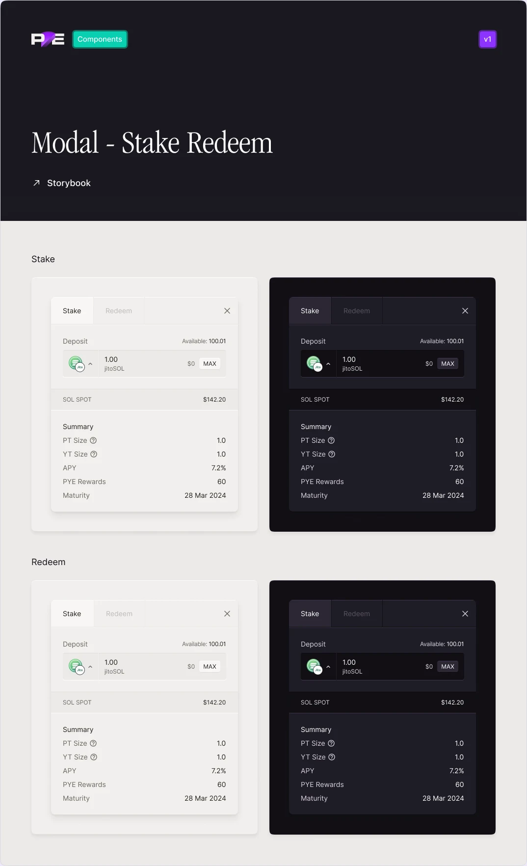
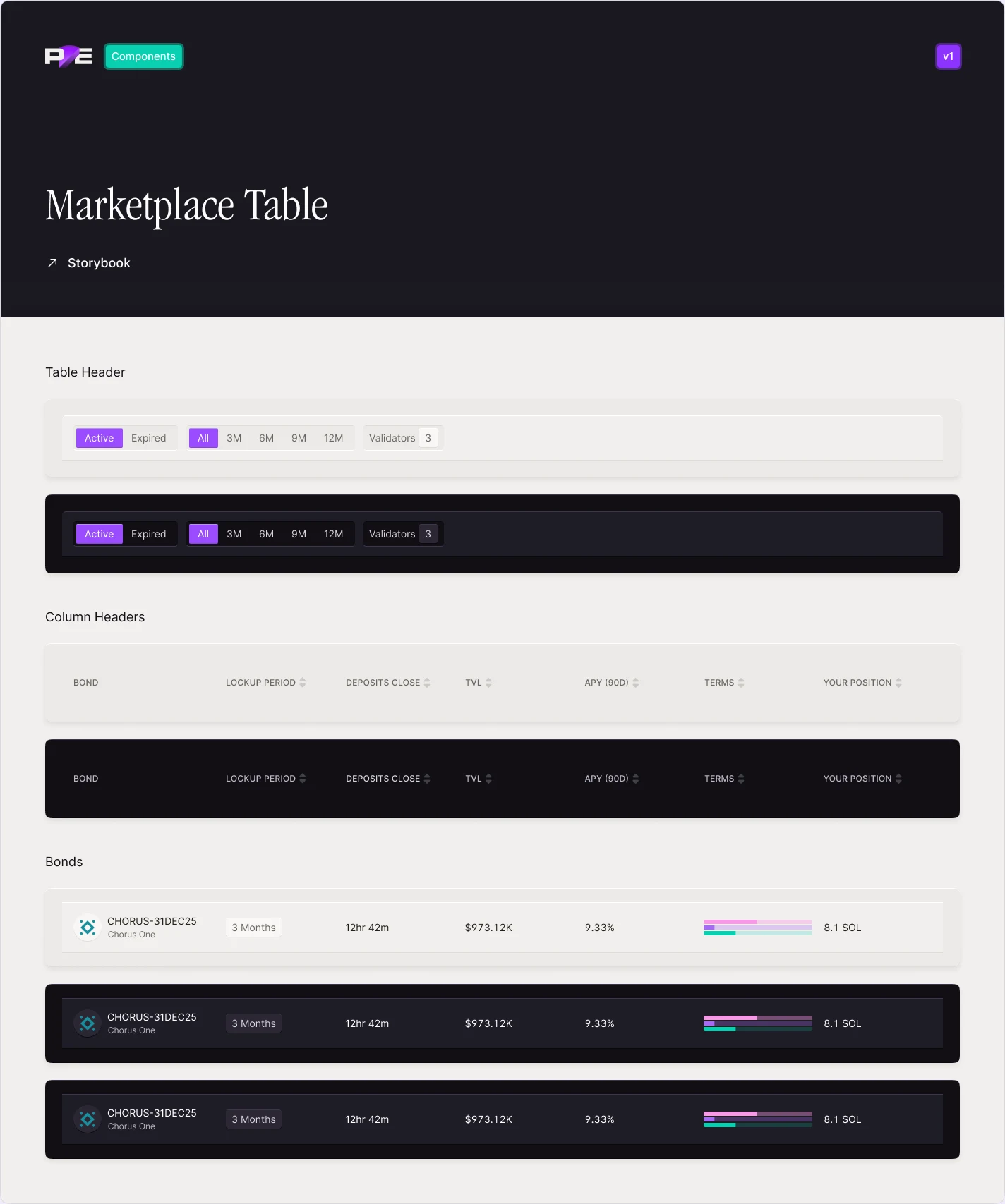
The Figma file grew to more than seventy pages: foundations, global components, and sets for operators and for trading. Each component is drawn in both themes, on the same layers.
In the product
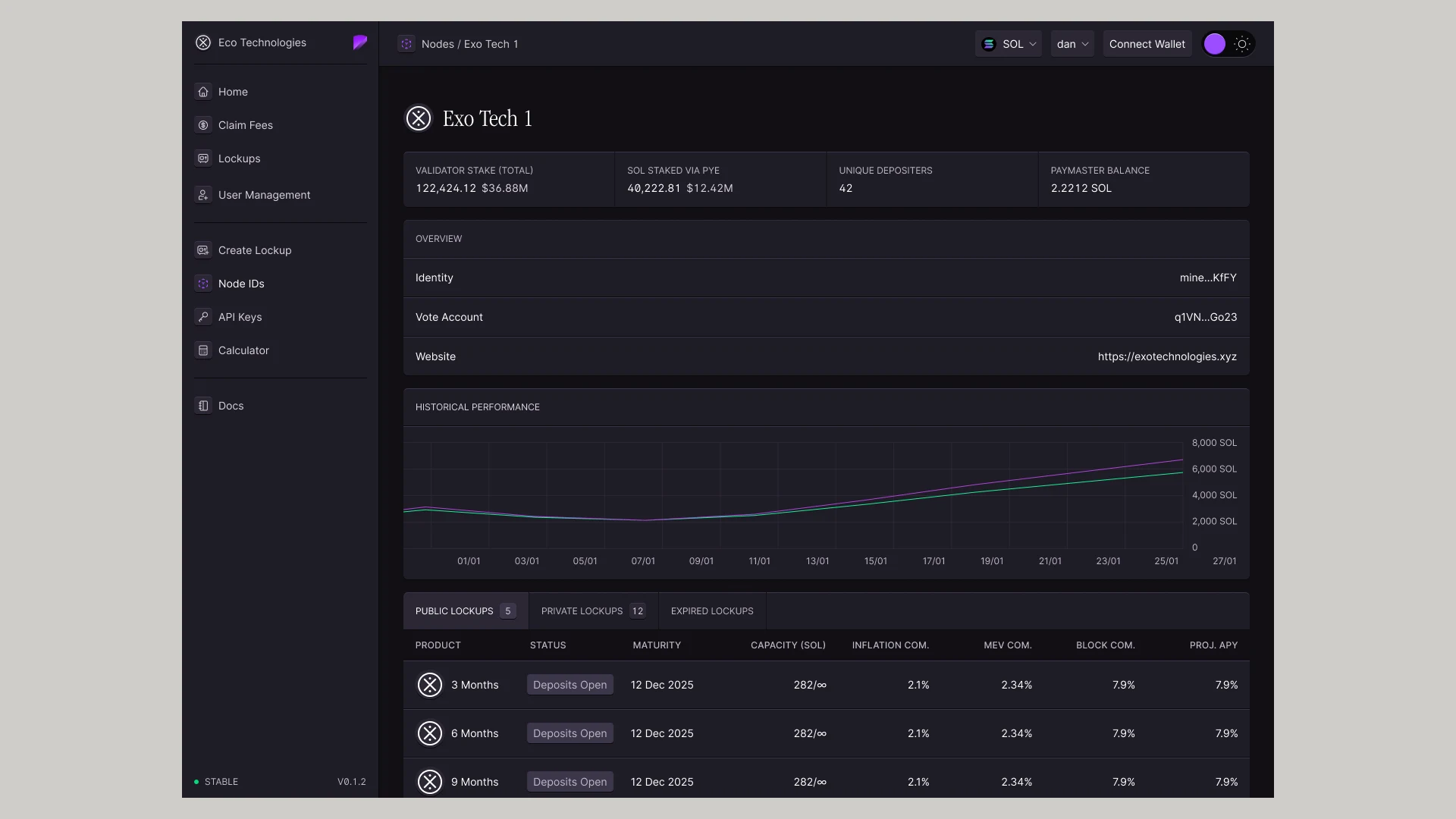
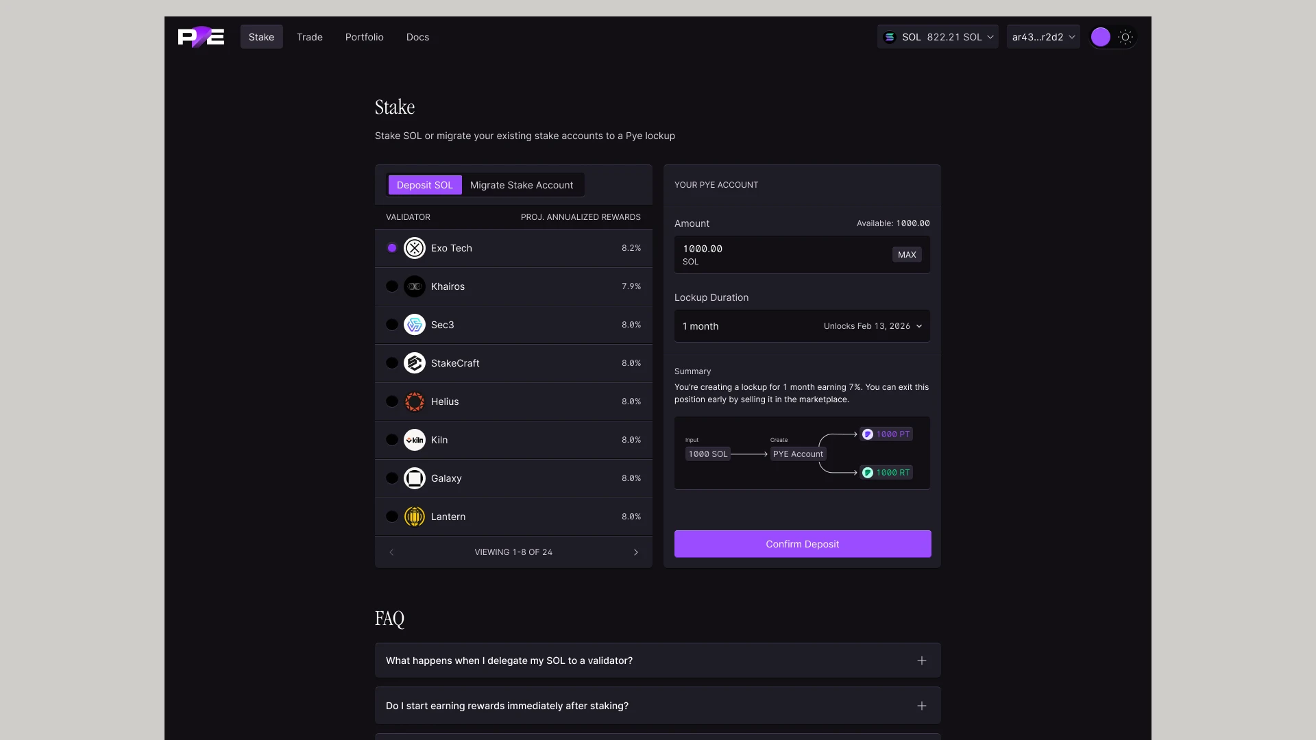
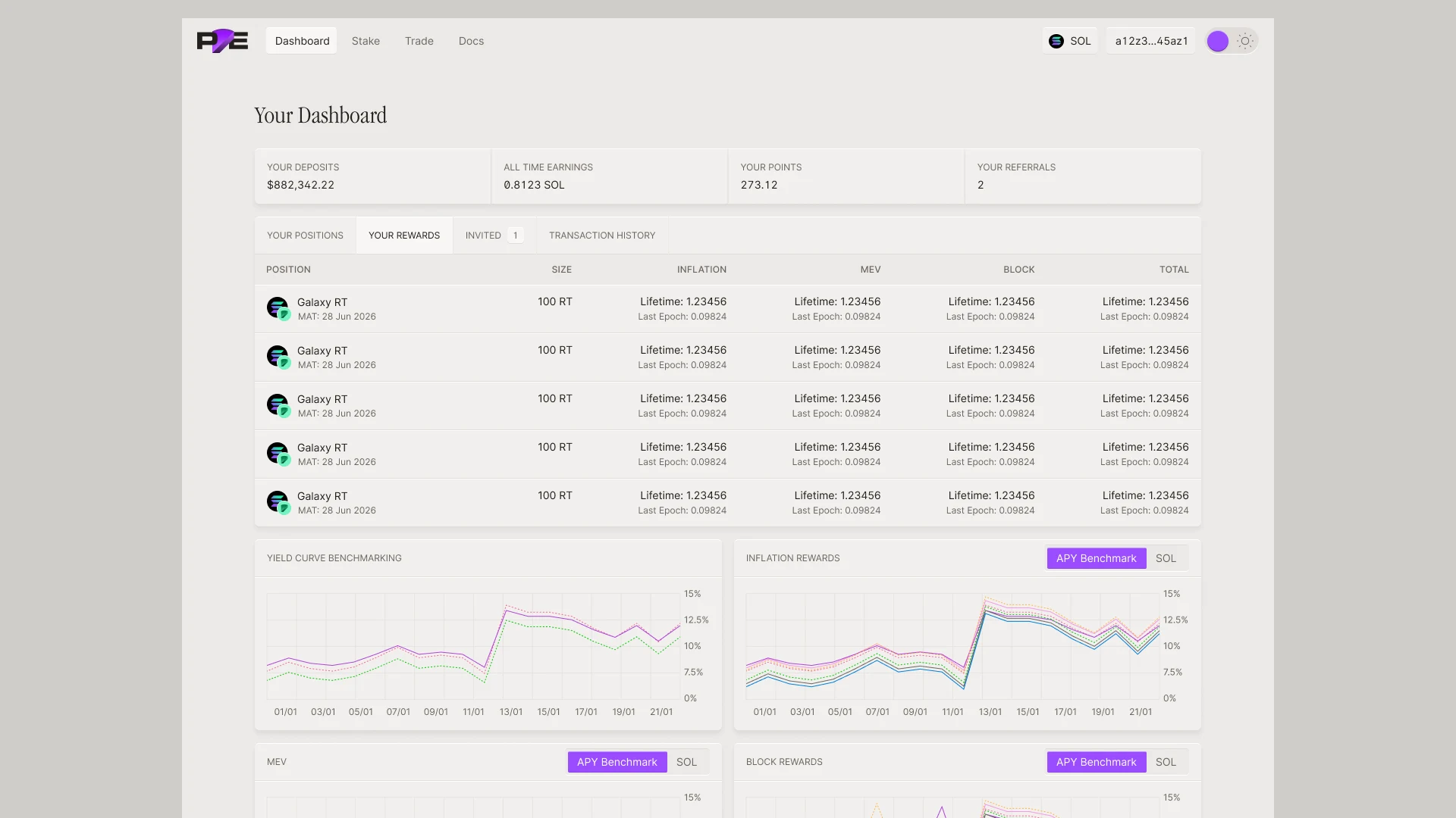
The same paper, from trading to the validator console.
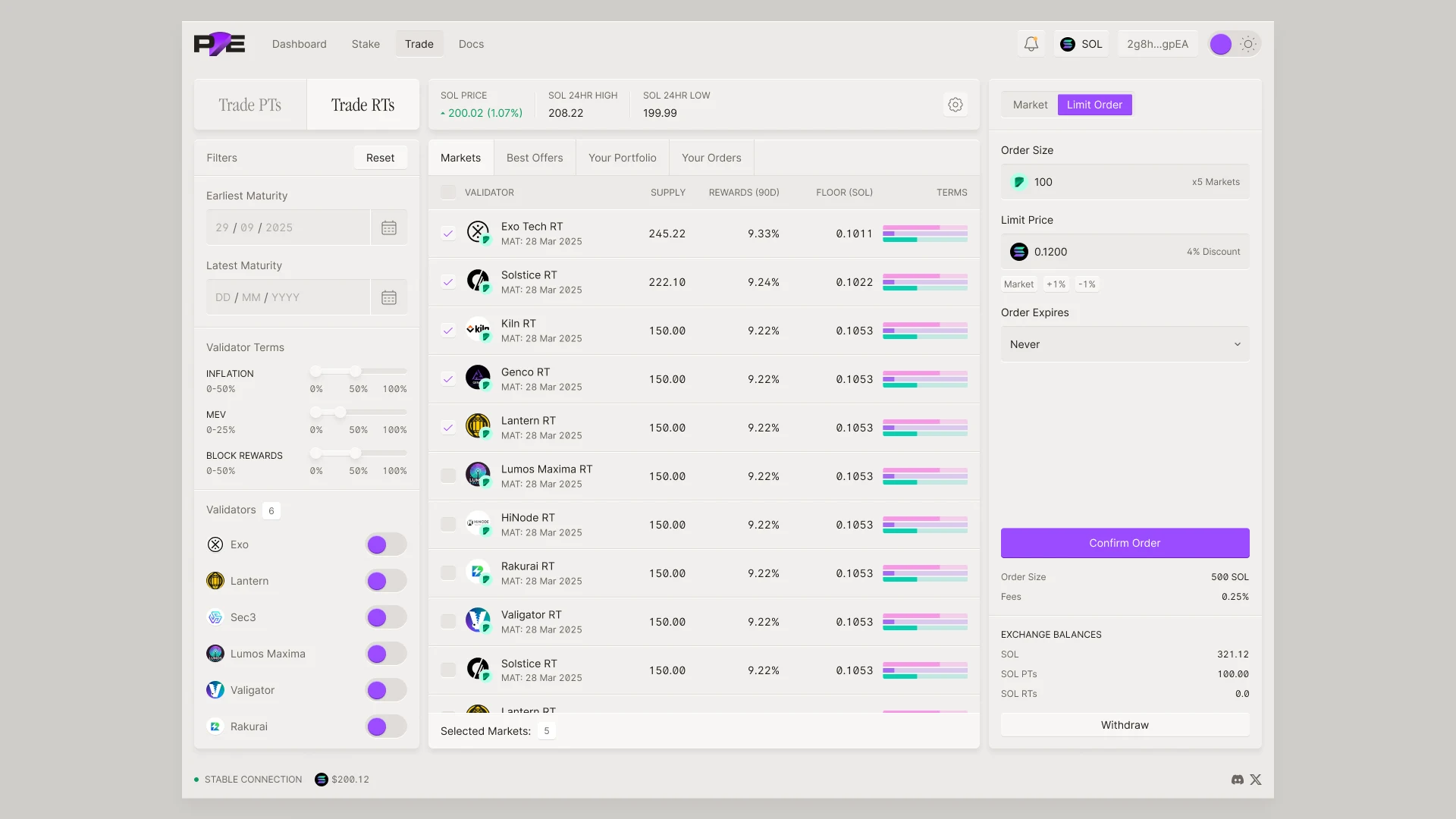
Every Pye surface was built from the same layers: the trading screen, the validator console in dark, staking and the personal dashboard.
A product of its own
Run like a product, for the people who build Pye.
A design system is only useful if the team can trust it. So Foundry has its own documentation, versioned from v1, with an overview, foundations, components and modules, and every page links straight to its story in Storybook.
Tokens are the contract. In Figma they are variables, in semantic layers like primary, surface and text, for both themes. In code they are CSS variables with the same names, so a design decision lands in production one to one. Chromatic ties Storybook back to Figma for component QA, because sometimes designs have errors too.
I set what goes in, review what comes back from engineering, and keep design and code from drifting apart as products come and go.
Into code
From Figma to Storybook to tokens.
Every docs page in Figma links to its Storybook story. Pye’s frontend team built Foundry into the product’s component library in June and July 2025, and the whole app moved onto it.
In February 2026 I took over the frontend, and Foundry with it. I rebuilt it with AI-assisted coding. One tokens file holds every colour, layer, edge and motion value and builds to CSS and typed constants. On top sit stateless React components with every state designed, and the brand’s judgment written down so AI tools apply it the same way the team does.
- Figma
- 70+ pages
- Storybook
- About 90 stories
- Themes
- Light and dark
- Foundry v2
- One tokens file, React components